


How Soviet propaganda can transform your presentation skills
The Tate Modern exhibition, ‘Red Star Over Russia’, features some incredible propaganda posters from the first half of the twentieth century. Behind them lay unimaginable terror. But the artwork is extraordinarily striking.
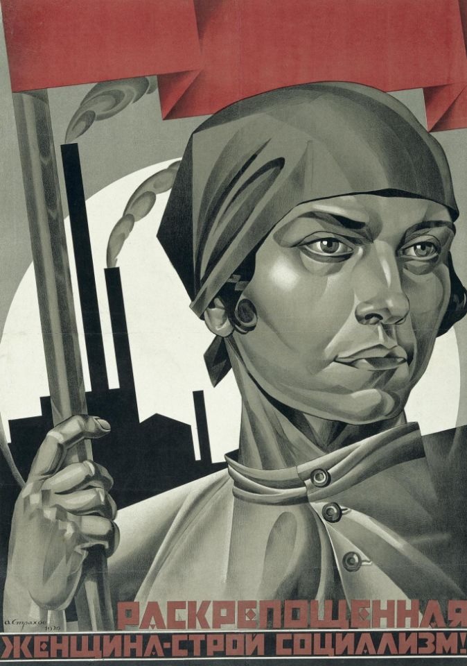
The Soviet poet, Vladamir Mayakovsky, suggested that a Soviet poster failed if it could not bring a running man to a halt. Which was why posters heavy with text created nothing like the same impact. Adolf Strakhov’s ‘Emancipated Woman Build Socialism!’ (pictured above and part of the David King Collection at the Tate) could bring a running tank to a halt, so clear its message, and powerful its impact.
So how is it, a century on, that sensible, ambitious and otherwise thoughtful business people are still giving presentations accompanied by slides like this?:

With that slide behind her, Judi Dench would struggle to keep your attention!
It never ceases to baffle me, how people work with Power Point. All too often it gets used as an excuse to share endless bullet points that simply summarise a speaker’s script. Don’t blame the software, but the way it is used to butcher entire presentations.
A great presentation should be all about the speaker and their message. It should be relevant to the audience in the room on the day, stressing the ‘why’ and the ‘how’ rather than the ‘what’. And a great slide should complement it. It should bring the key points to life through illustration. And it’s so simple. Say the ‘Legal Compliance’ speaker were to replace those yellow bullets with this:

The ‘why’ is immediately clear – ignoring legal compliance can bring shame on you and your business. So sit up and listen. This matters!
The picture grabs attention and makes the point itself more powerful. And there’s an additional reason to listen to the speaker: her script is no longer on the screen in front of you. So you can’t read it and then lose attention!
This really isn’t rocket science. The advertising industry has understood the value of visual impact for generations. Imagine if this:
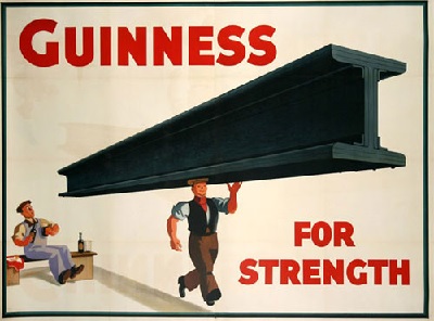
had been replaced with a slide containing the following bullets:
- Black drink with white top
- Guinness stout made from water, barley, roast malt extract,hops and brewer’s yeast
- Taste developed by roasting the barley
- Stock pasteurised and filtered
- 198 calories per pint, equivalent to a light beer
In all likelihood, the beer tents at Cheltenham this coming March would be serving Mackeson Stout!
As someone paid to put words on a page, it pains me to say it, but less really is more. And when it comes to slides, I’m a big fan of absolutely no words at all. Ironically, there’s a hell of a lot your typical commercial business presentation could learn from those Bolsheviks!
lawrence@greatspeechwriting.com
+44 (0)207 118 1600


